- February 16, 2023
- Posted by: rafi
- Category: Embroidery Digitizing

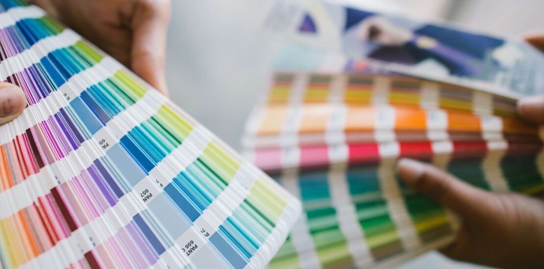
Colors are vital in hand stitching. It sets the tone for the entire piece. Bright colors offer fun and cheer, while dark colors can add a sense of refinement. This blog will go over various color elements quickly and provide recommendations for selecting a palette for the project. Color is probably one of your most powerful design influences, so choose wisely. When designing for commercial embroidery, color is not taken lightly. Many patterns require certain hues, such as skin, foliage, and fruit. That doesn’t imply your colors are set in stone. The options are unlimited with hundreds of hues of Royal Polyester Thread alone.
Color Concept:
Monochromic: Using a monochromatic color means you’ll be playing with the tints, hues, tones, and shades of only one color in the same project.
Triad: Three different colors separate these colors. These three colors’ tints, hues, tones, and shades can be mixed and matched.
These hues are analogous because they are neighbors and make a highly pleasant color combination. Combine the tints, hues, tones, and shades of these related colors.
Because they are on opposite sides of the color wheel, they accentuate each other. Various tints, hues, tones, and shades of these colors might be used to set the mood of the project.
Forms of color:
Tint (Light): Add a small amount of white to lighten any color. The lighter hue can be identified when the colors appear softened and lightened. These colors are generally associated with relaxing, soothing, loving, innocent, cherubic, Misty, soft, mellow, and sweet feelings.
Hue (Vivid): The purest type of color. It is the hue and real reflection of the color, and its brilliance quickly catches your attention. These hues are regarded to be vibrant, passionate, alive, youthful, energetic, fun, joyful, festive, and exciting.
Tone (Muted): Adding a degree of grey to the hue creates a muted version that sets the tone of the color. It has a worn-out or washed-out appearance. They’re seen as organic, natural, aged, faded, rustic, worn, cerebral, boring, and dull.
Shade (Dark): Add a degree of black to the hue to achieve a dark shade. The same way that other materials drenched in the water turn it into a dark tint. These hues represent mystery, seriousness, intricacy, tradition, history, refinement, richness, and elegance.
When you discover variations on the fundamentals, the journey begins. Instead of utilizing the “genuine” version of a color, experiment with a lighter or darker tint. Use varying amounts of the triadic colors red, yellow, and blue. Another factor to consider while choosing colors is color temperature. Blues and greens, for example, are regarded as “cold,” whilst reds and oranges are regarded as “warm.” A color wheel can be used to find the warm and cool of each color.
Bottom line:
It is usual for palette selection to take some time. These approaches will make color selection easier and faster for you. More practice and experience will only help you better. Play with colors without fear and create your own unique style!
